From catalog clutter to clear paths.

I designed and built a website where every buyer knows what Megalumens makes for them, and how to quote it or buy it.

Overview

Megalumens: a lighting brand since 1958, redesigned around its buyers

Megalumen's Iluminación, a family-run lighting manufacturer from Guadalajara, had a static website crowded with supplier banners, 2017 price lists and dead links, while its store lived on a separate domain. I designed and built the new site in WordPress and WooCommerce, organized around who is buying: engineers and architects, companies and warehouses, and homeowners, each with a clear path to quote or shop.

Client
Megalumen'sLighting manufacturer · Guadalajara · since 1958
Product
Website & storeRedesign, built in WordPress + WooCommerce
Role
Designer & DeveloperUX research, UI design & WordPress build
Platform
WordPress + WooCommerceResponsive site, online store & quote forms
Tools
Figma · MazeWordPress · WooCommerce
Year
2025Design, testing & development
01 · Context & challenge

Six decades of light, one cluttered front door

Megalumen's started in 1958 as a small workshop in Guadalajara making chandeliers and ceiling lamps. Today it manufactures industrial and commercial lighting for clients across Mexico, with a distribution warehouse in Culiacán. Its website had not kept up.

  1. 1958A small family workshop makes chandeliers and ceiling lamps for local clients.
  2. 1976Father and sons found Indapisa and start producing for commercial and industrial markets.
  3. 1996Indapisa becomes Megalumen's Iluminación and industrializes its processes.
  4. TodayA national manufacturer of industrial & commercial lighting, still family-run.
Illustrative recreation of the previous homepage, based on the public site.
  • Other brands first. Supplier catalogs and promos filled the homepage before Megalumens' own products.
  • Outdated & broken. 2017 price lists, menu items pointing to “#” and a store on a separate domain.
  • No path to buy. No clear way to quote a project, shop online or know who each product was for.

The site promoted other brands' catalogs better than it explained what Megalumens makes.

The challenge

How might we turn a catalog dump into a site that tells each buyer what Megalumens makes for them, and how to quote it or buy it?

02 · Research & diagnosis

A heuristic audit before a single pixel

I reviewed the existing site and store against Nielsen's 10 usability heuristics. Every finding became a design requirement.

Finding

Design requirement

Four insights that shaped the redesign

  • 01Cognitive overload

    20+ menu items and technical categories forced users to think before they could browse.

  • 02The content paradox

    So much content on the homepage that the core business got lost: residential lamps? commercial lighting?

  • 03An invisible technical barrier

    Specialized terms without a glossary left out architects and homeowners alike.

  • 04Mobile as a second-class citizen

    Key functions such as filters were hidden on mobile.

The problem wasn't the products. It was the path to them.

03 · Strategy & architecture

Navigate by who you are, not by what's in the warehouse

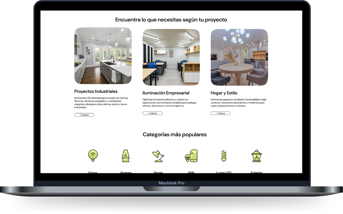
The key decision was to organize the site around three buyer profiles. Each one gets its own page, language and path to a quote, while the store and the catalog stay shared.

HomeProfile selector
PageProyectos industriales
    Before

    20+ menu items

    After

    8 clear sections

    • Inicio
    • Nosotros
    • Proyectos industriales
    • Iluminación empresarial
    • Hogar y estilo
    • Tienda
    • Blog
    • Iniciar sesión
    Megalumens redesign on a laptop: 'Find what you need for your project' with the three buyer profiles and popular categories

    Three buyers, three doors, one catalog.

    • Smart store filters to find products that share specs.
    • A blog fed by social topics: tips and opinions buyers already ask about.
    • Newsletter aligned with the Mailchimp engagement strategy.
    04 · Interface design

    One message, two actions

    The new home answers “what does Megalumens sell?” in its first screen, then guides each buyer to a profile, a category or the store. Every section ends in one of two actions: quote a project or visit the store.
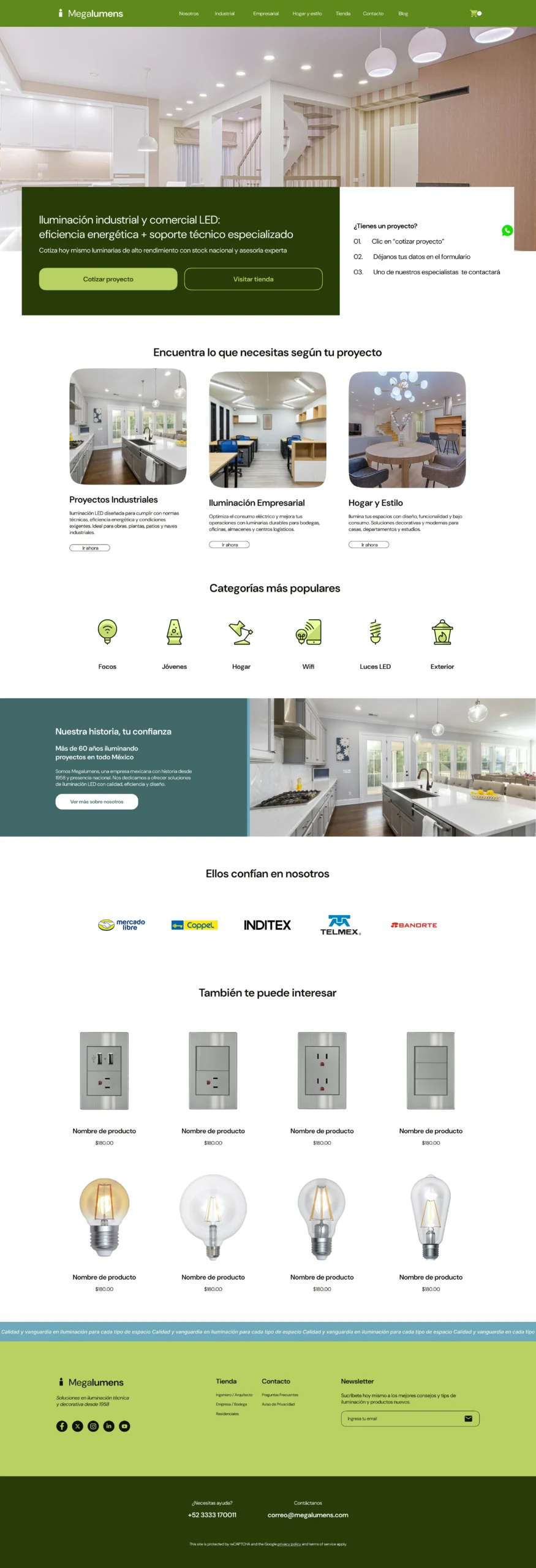
    Full homepage of the Megalumens redesign: hero with quote and store actions, buyer profiles, popular categories, company story, products and footer

    Hover, scroll or tap the preview to explore it at your own pace.

    Quote it or buy it: every screen answers one of the two.

    Brand System

    Color Palette

    Process I presented two color proposals to the client. The final system keeps the greens for the brand and its actions, and adds Deep Space Sparkle and Moonstone Blue to give calmer sections, like the company story, their own voice.

    05 · Validation & build

    Put in people's hands before a line of code

    I tested the interactive prototype in an unmoderated Maze study with 10 participants: a five-second test, free exploration of the site and short opinion questions.
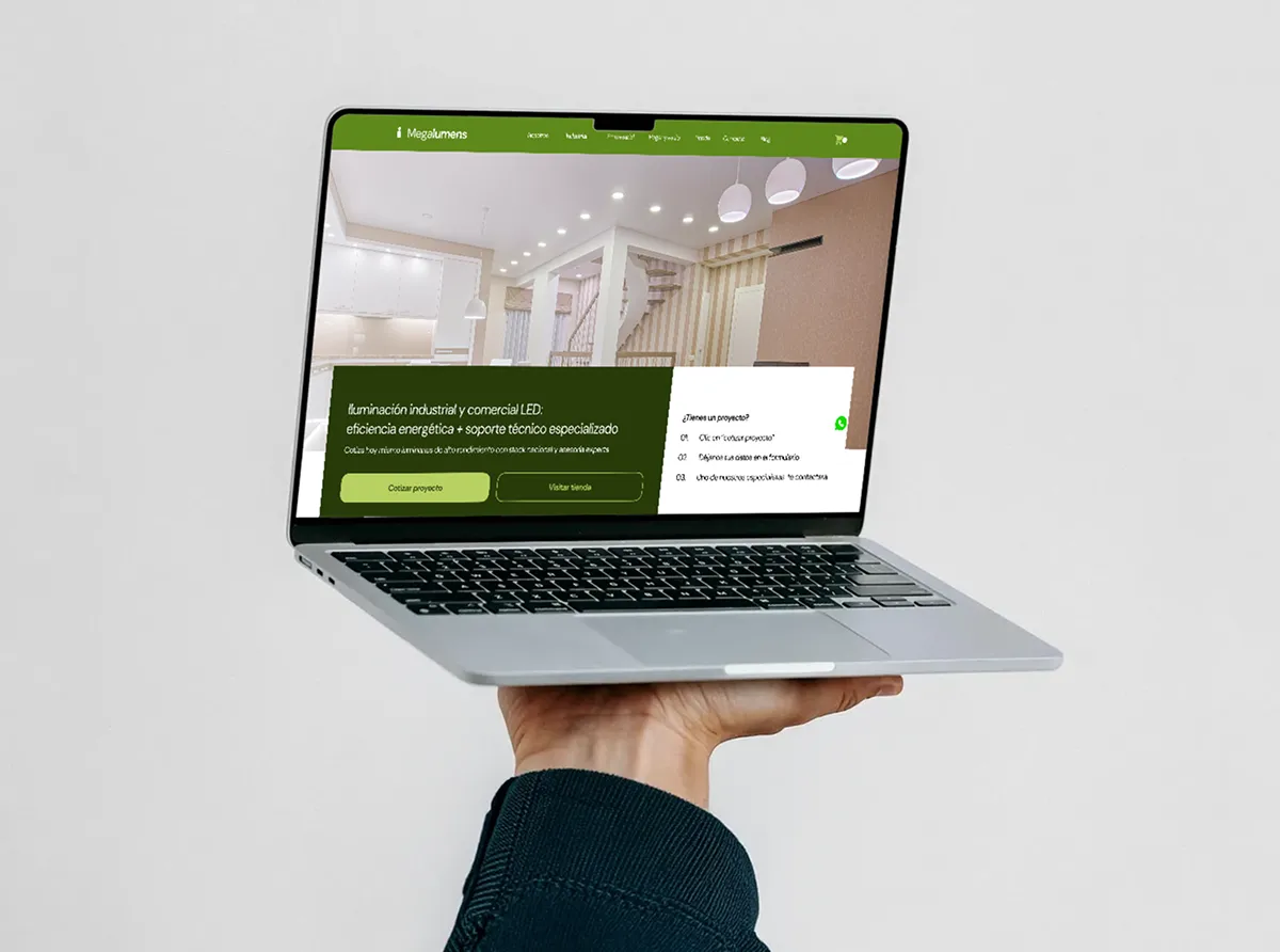
    The Megalumens prototype on a laptop held in one hand
    Maze · July 31 · 10 participants
    • 5-second test · “What does Megalumens sell?”

      7/ 9

      answered lighting after seeing the home for five seconds.

      1 answered “interior design”, 1 gave no valid answer.

    • “Is it easy to use?” · 1–5

      4.3/ 5

      • 55
      • 41
      • 30
      • 20
      • 11
    • “Is the information clear?”

      7/ 7

    • “Would you trust this brand?”

      7/ 7

    • Free exploration · 7 responses

      74.9s average

      Participants moved freely across all eight sections: home, about, the three profiles, store, blog and contact.

    What participants asked for → next iteration

    • “Information about the company, and where it's located.”

      Next: bring the 1958 story and the Guadalajara location into the main path, not only the About page.

    • “Relevant product details, like when it's better to install one or the other, examples of use, advantages.”

      Next: usage guidance and comparisons on product pages, in each profile's language.

    • “Just hovering over the contact tab sends you there. I didn't like that it went without a click.”

      Next: navigation that only acts on click or tap, never on hover.

    Quotes translated from Spanish. Results come from my own Maze test, not from client analytics.

    Then I built it

    No handoff in between: I took the validated design into WordPress and WooCommerce myself, so the decisions tested in the prototype didn't get lost in a handoff.

    1. FigmaDesign system & prototype
    2. MazeValidation with users
    3. WordPressProfile pages & quote forms
    4. WooCommerceCatalog & online store
    06 · Impact & learnings

    Less noise, clearer paths

    Without post-launch analytics to share, the impact is shown as the friction the new site removes, compared with the previous one.

    • Navigation

      20+ menu items, some pointing nowhere

      8 sections, three of them by buyer profile

    • Homepage

      Supplier catalogs and promos competing for attention

      One message and two actions: quote or shop

    • Buying

      A store on a separate domain, no quote path

      Store in the main menu and a 3-step quote form

    • Contact

      Email and phone at the bottom of the page

      WhatsApp always at hand and quote forms per profile

    • Language

      Technical terms without context

      Plain names and icon categories for every buyer
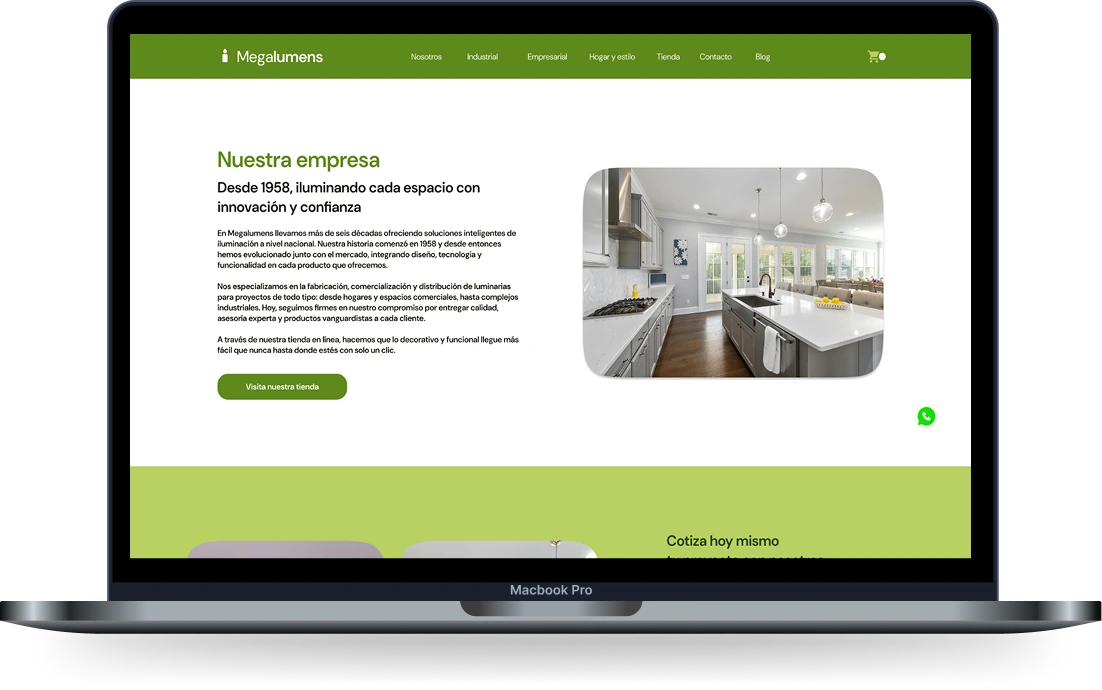
    Megalumens redesign on a laptop: 'Nuestra empresa' page, since 1958 lighting every space with innovation and trust
    “Nuestra empresa”: since 1958, heritage as a trust signal.
    1. 01
      Clear beats complete.

      The old site showed everything. The new one translates technical lighting into each buyer's language, and that is what made it feel easy.

    2. 02
      Test the interactions, not only the layout.

      A menu that opened on hover frustrated a participant. Micro-interactions shape trust as much as visual design.

    3. 03
      Heritage is a conversion asset.

      Participants asked who the company is and where it is. A story since 1958 belongs in the buying path, not hidden in a video.

    A company founded in 1958 didn't need to look new. It needed to be easy to understand.
    Have a project in mind? Let's build it.

    Next project Dr Spicy Artisanal hot sauce e-commerce · Brand & UX Case Study