Strategic & analytical
Decides with data, audits and information architecture. Designs to solve a business problem.
- Is
- Rigorous, measurable, clear about the why.
- Isn't
- Cold, academic, full of jargon.
The identity behind Burruel Studio: what the studio believes, how it speaks and how it looks. Built the way I build for clients: decisions first, surface second.
A studio that sells process can't have a brand built on taste alone. So I started with the decisions: what Burruel Studio believes, who it is for and how it should sound. Only then did I define the visual system. The result is an identity manual that guides the website, social media, proposals and the design system that comes next.
Everything else follows from here.
The problem is rarely the technology. It's what was decided, or not, before building it.
Portals, apps, internal platforms and websites that sell. The deliverable is the screen; the work is the decision behind it.
Data, heuristics and process maps live next to color, grid and silence. Neither side is sacrificed for the other.
Each decision made
before the first screen is drawn:
that is the design.
Burruel Studio has a studio's name and a person's face. Juan signs, Juan speaks, Juan replies. Clients know who they work with from the first email to the final handoff.
For companies about to invest in a digital product that can't afford to build the wrong thing, Burruel Studio is the UX and strategy studio that maps the process before designing the screen. An agency delivers interfaces. I deliver decisions: what to build, for whom, and how to know it worked.
Service blueprints, process maps, heuristic audits and benchmarks. The operation is understood before a button is drawn.
Proposals are tested with real users and presented with their impact on time, money or risk.
Seven years of experience and one accountable person. No account layers between whoever decides and whoever designs.
Processes on paper, spreadsheets or ERPs that nobody fully understands.
Clear UX and process before development, so sprints aren't redone.
Product structure before design debt turns into technical debt.
Today their site is a brochure. They need a salesperson.
task completion in usability tests after auditing my own 2019 design.
Read the case → Megalumens · Website & store7 / 9participants identified what the brand sells within five seconds.
Read the case → Warranty platform · MVP−49%time to register a warranty between test rounds (small sample).
Read the case →It listens first, draws the process on the whiteboard and closes with a line everyone repeats afterwards.
Decides with data, audits and information architecture. Designs to solve a business problem.
Breaks the corporate cliché with contrast, full color and methods tested from scratch.
Designs for the service technician and for the lighting buyer. Speaks like a person.
Every element has a job. Empty space works too.
The useful tension sits between the first two axes: a lot of rigor, said up close. If a piece feels cold, add the human. If it feels light, add evidence.
The problem and its impact first. Never "in today's fast-paced world".
Aesthetics matter because they sell or build trust, not on their own.
Close with a short line people can repeat in the meeting.
"What I do", "in seven years I've seen it". Experience in first person.
| Channel | Tone | Language | Sounds like |
|---|---|---|---|
| Website | Confident, with evidence | English | "I map the process before I design the screen." |
| Analytical, reflective, first person | Spanish | "Your research didn't fail. The meeting where you presented it did." | |
| Direct, didactic, with a punchline | Spanish (Mexico) | "There are two kinds of company websites: brochures and salespeople." | |
| Proposal | Precise, sober, decision-oriented | The client's | "Before quoting screens, I propose two weeks to map the process." |
| Email & DM | Close, brief, resolving | The client's | "Thanks for writing. How about 30 minutes on Thursday to understand the problem?" |
Inspiration only gets in if it becomes a decision that can be repeated.
Color is used in flat blocks, never as decorative gradients. One field dominates; the rest accompany it.
Grid lines, rules and labels stay visible. Raw materials like concrete and stone hold the image.
A 12-column grid, sharp hierarchy and simple geometry. Nothing goes somewhere "because it looks good".
Three protagonists per piece at most. Empty space is part of the message.
Illustrations are abstract studies drawn for this page, not reproductions of any artwork.

Signature. Buttons, navigation, one leading field.
Main background and text on light.
Strong field: emphasis sections, covers, charts.
Soft background for cards, tags and testimonials.
Soft background for data and process blocks.
Sparks and alerts. Never a large background.
Typical proportion in one piece.
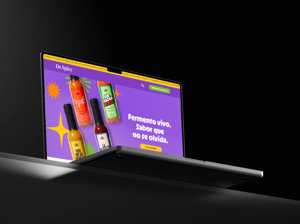
The client's color is the field. The frame is Burruel. Every case study takes the client's color in its hero (purple for Dr. Spicy, blue for SITEUR, green for Megalumens). The lime, the type and the grid never change.
Light on light, or blue on goth. Shreak, bratz and fuzz on each other or on white fall below 1.5:1; internet blue on goth is 2.6:1. One of them becomes the background and the text goes goth or white.
Processes before screens.
Selected works, client feedback.
The warranty process ran on paper tickets and each operator's judgment. The first step wasn't designing an app; it was drawing who touches each warranty, and when.
Overview · 01 Context & challenge · Role · Tools · Year
Ratio 1.5 on a base of 16. Negative tracking on headlines; positive tracking on uppercase labels.
Base 8. Every space is a multiple of 8: 8, 16, 24, 40, 64, 104. Silence: at least 40% free space in brand pieces. If a cover, slide or post needs more than three elements to be understood, it becomes two.
The digital product on its device, resting on stone or concrete, in natural light.
A flat background in the client's color with the product at the center. The spark may join, never crowd.
Real photos of the work: sketches, whiteboards, sticky notes, the printed blueprint. No stock handshakes.
Three sketches that show the pieces together. Not final artwork.
UX · Strategy · Product
Guadalajara, Mexico
burruelstudio.com
Burruel Studiov1.0
Message sent. Thank you!
I'll get back to you within 1–2 business days.